7. CSS Grid & Flexbox
You picked the perfect time to begin learning about HTML and CSS. It is the best it has ever been.
In our dark past, the creators of web browsers didn't do a good job at cooperating. We had to use things called polyfills and vendor prefixes to make sure our designs worked correctly in every possible browser.
Like some kind of animals, we would use HTML tables to create page layouts. Google "spacer.gif" for nightmarish comedy gold. It was a bunch of horrible hacks.
Many of us have used the float property to create page layouts for many years. You have already dealt with some of the limitations of that approach. It's okay. But still not ideal.
In this glorious modern age, the browser makers are cooperating pretty well. And we now have fancy tools like CSS Grid and Flexbox.
We are blessed.
CSS Grid
Creating a layout with CSS grid solves several problems associated with float-based layouts, including:
- You can make elements automatically expand vertically to fill the available space. That means equal-height columns without any hacks!
- You don't have to worry about clearing floats.
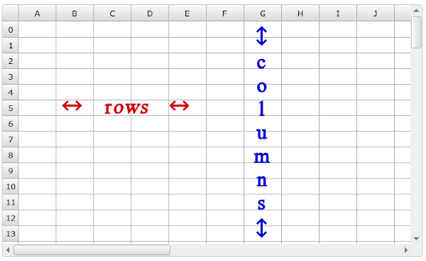
A grid is simply a set of horizontal and vertical lines. It's the same idea as a spreadsheet. The spaces between the horizontal lines are the rows. And the spaces between the vertical lines are the columns.
And we can use this grid structure to precisely place elements on the page.
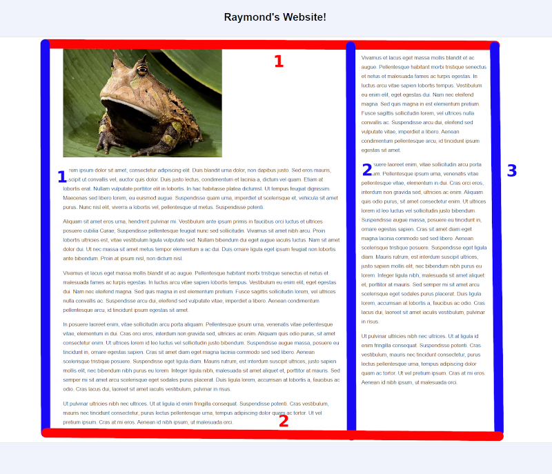
Let's start with the float-based layout I created in lesson 6 and convert that to a simple CSS Grid layout.
Within the body of the HTML, I used this basic structure for the layout:
<header class="banner">
   <h1>Title of my Website</h1>
</header>

<div class="content-wrapper">

   <main>
      <!-- main content of page here -->
   </main>

   <aside class="sidebar">
      <!-- supplementary information here -->
   </aside>

</div> <!-- end of content-wrapper div -->

<footer class="site-footer">
   <!-- footer content here -->
</footer>
display: grid
To create a grid, you can apply display: grid to an element. That element becomes the grid and each immediate child of that element becomes a "grid item".
I enclosed the main and aside elements inside a div with the class "content-wrapper". So, I'll make that div the grid:
.content-wrapper {
   display: grid;
}
And the main and aside elements will become the grid items. We'll be able to place these grid items anywhere we would like within the grid.
When using CSS Grid, these lines are imaginary. Because of that, it's a good idea to sketch your lines on a piece of paper so you have a visual representation of your grid.
We're going to start by creating a very simple grid with only 1 row and 2 columns. That means we will have 2 horizontal lines and 3 vertical lines:
Now, we need to draw these imaginary lines with CSS. And this will be super easy with our simple grid.
grid-template-columns
To accomplish this, we'll use the grid-template-columns property:
.content-wrapper {
   display: grid;
   grid-template-columns: 3fr 1fr;
}
By providing these 2 values for grid-template-columns, we are establishing that there will be 2 columns.
And I have used the fractional unit of measure (fr). This determines what fraction of the space across that each column will occupy.
This means that the first column will take up 3/4 of the width across. And the second column will take up the remaining 1/4.
And that's it!
We can remove the float and width properties from the styling for the main and aside elements. And CSS Grid will take over and do its magic.
Main and aside are the immediate children of the "content-wrapper" div. The main element appears first in my HTML. So, the main element will automatically be placed in the first column. And the aside will be placed in the second column.
That was super easy. Now, let's dive just a little bit deeper and create a grid with 3 rows and 2 columns:
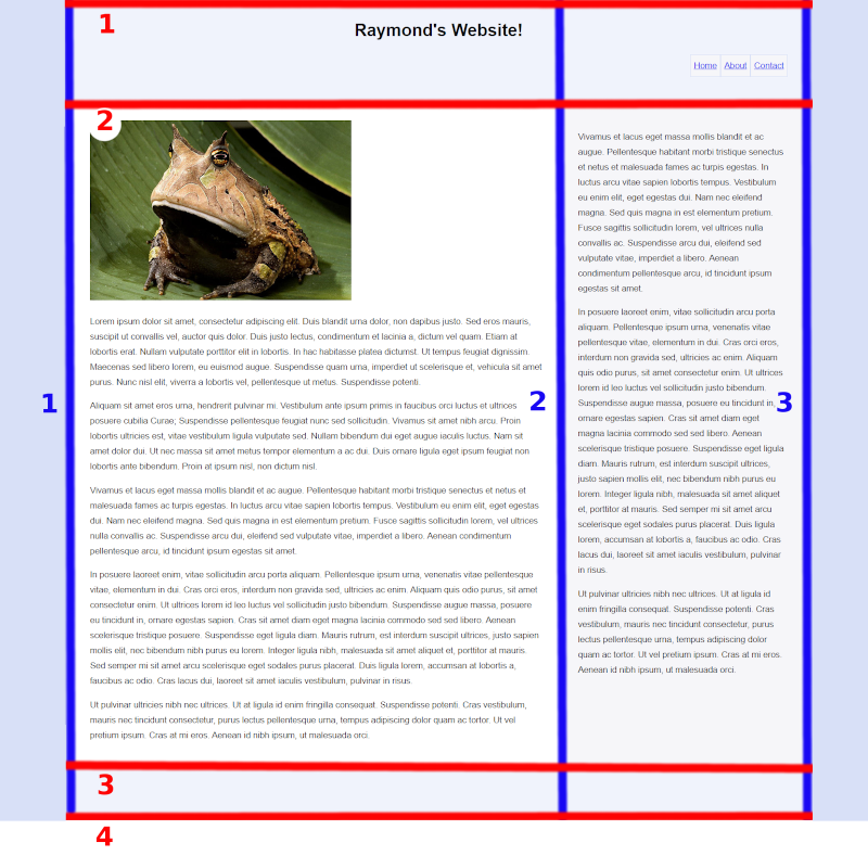
In order to accomplish this, I'm going to make a slight change to the HTML code. I'm going to enclose the header, main, aside, and footer elements inside of a div:
<div class="wrapper">

   <header class="banner">
      <h1>Title of my Website</h1>
   </header>

   <main>
      <!-- main content of page here -->
   </main>

   <aside class="sidebar">
      <!-- supplementary information here -->
   </aside>

   <footer class="site-footer">
      <!-- footer content here -->
   </footer>

</div> <!-- end of wrapper div -->
So now, the header, main, aside, and footer elements will all be grid items.
I chose to name the class "wrapper" this time as a personal preference. You can name classes anything you would like. But class names like "container" and "wrapper" are commonly used for this purpose.
grid-template-rows
We can establish our number of rows and their heights using the grid-template-rows property.
I want the banner to expand vertically to the height required to contain the content. So, I'll just use "auto" as the height for the first value.
I also want the main and sidebar to extend down automatically. So, "auto" again for the second value.
The third row is the footer. In my layout in lesson 6, I used min-height: 6em. That will work fine. But to demonstrate, I'm going to provide a minimum and maximum height for that row using the minmax() CSS function:
.wrapper {
   display: grid;
   grid-template-rows: auto auto minmax(6em,auto);
}
The footer will have a minimum height of 6em and its maximum height will be handled automatically.
So, we have established that there are 3 rows. Now, we need to define our columns using the grid-template-columns property.
We need 2 columns since we want the main element and the sidebar to line up side-by-side.
Just like we did in the first example, we'll make the first column take up 3/4 of the width. And we'll make the second column take up 1/4 of the width.
.wrapper {
   display: grid;
   grid-template-rows: auto auto minmax(6em,auto);
   grid-template-columns: 3fr 1fr;
}
grid-template-areas
So, now we have a grid with 3 rows and 2 columns. Next, we need to establish what will appear in these rows and columns using the grid-template-areas property.
In the first row, I want the banner to extend all of the way across the 2 columns. Then, I want main and sidebar side-by-side in the second row. And I want the footer to extend across the 2 columns in the third row:
.wrapper {
   display: grid;
   grid-template-rows: auto auto minmax(6em,auto);
   grid-template-columns: 3fr 1fr;
   grid-template-areas: "banner banner" "main sidebar" "footer footer";
}
And it's commonly entered in the CSS like this so you have a visual representation of the layout:
grid-template-areas: "banner banner"
                     "main sidebar"
                     "footer footer";
grid-area
But the browser isn't going to "know" what I mean when I refer to "banner", "main", "sidebar", and "footer". These names are sort of like classes in that you can name them anything you would like.
To communicate which elements I am referring to, I need to use the grid area property.
.banner {
   grid-area: banner;
}

main {
   grid-area: main;
}

.sidebar {
   grid-area: sidebar;
}

.site-footer {
   grid-area: footer;
}
This is communicating what we mean when we use names like "banner" for the grid-template-areas property. In this case, it's saying that when I enter "banner" as a value, I'm referring to the element in the HTML with a class named "banner".
Since this is a column layout, I would only want this to take effect on large displays, such as desktops and laptops. So, all of this styling will be inside the media query:
@media (min-width: 768px) {

   .wrapper {
      display: grid;
      grid-template-rows: auto auto minmax(6em,auto);
      grid-template-columns: 3fr 1fr;
      grid-template-areas: "banner banner"
                           "main sidebar"
                           "footer footer";
   }

   .banner {
      grid-area: banner;
   }

   main {
      grid-area: main;
   }

   .sidebar {
      grid-area: sidebar;
   }

   .site-footer {
      grid-area: footer;
   }

}
This styling will only take effect if the screen or window is at least 768px wide.
grid-column
As an alternative to using the grid-template-areas and grid-area properties, we can instead use the grid-column property.
We're going to use our column line numbers to specify where each element will be placed in the layout.
Let's take another look at our grid and the column line numbers:
The blue vertical lines are the column lines.
- The banner will extend from line 1 all of the way across to line 3.
- The main element will go from line 1 to line 2.
- The aside will go from line 2 to line 3.
- The footer will extend across from line 1 to line 3.
We can express that with the grid-column property like this:
.banner {
   grid-column: 1 / 3;
}

main {
   grid-column: 1 / 2;
}

.sidebar {
   grid-column: 2 / 3;
}

.site-footer {
   grid-column: 1 / 3;
}
There are a couple of ways of providing values for this property. You can see another option in the first example on w3schools.
There is much more that could be explored in this area. The grid could get much more complex and there are more properties to learn about. But this gives you a good amount to chew on for now.
See the this page and this page for more information about CSS Grid.
Flexbox
While CSS Grid is 2-dimensional, Flexbox is 1-dimensional.
A CSS Grid can have both columns and rows. With Flexbox, you can choose either column or row.
You might first think this means that CSS Grid will always be the better option. But that's not the case. Flexbox has unique capabilities that are not offered with CSS Grid.
CSS Grid is often the best choice for laying out the structure of the page. And Flexbox can be used within that grid to gain even more control over the placement of elements. It's all about finding the right tool for the job.
And note that you can also have grids within grids, flexboxes within flexboxes, and grids within flexboxes. This can open up a mind-boggling number of interesting possibilities.
display: flex
Just like with CSS Grid, you need a parent element or "container". When you apply display: flex to that element, each immediate child becomes a "flex item". And then you can control the placement and behavior of each of these child elements.
In this example, the div with the class "container" is the parent. The 3 divs inside are the children.
<div class="container">

   <div class="one">1</div>
   <div class="two">2</div>
   <div class="three">3</div>

</div> <!-- end of container div -->
If I used this in my CSS...
.container {
   display: flex;
}
...The parent div is now a flex container. And the "one", "two", and "three" divs are the flex items. I can now use Flexbox properties to control the placement of these 3 divs within its container.
If I added any elements inside those 3 child divs, those elements would not become flex items. It's only the immediate children.
Although, as noted above, you could apply display: flex to one of these child divs and then its immediate children would become flex items.
flex-direction
row
.container {
   display: flex;
   flex-direction: row;
}
The flex items will appear in a row across:
The red dotted border represents the boundaries of the .container div.
row-reverse
.container {
   display: flex;
   flex-direction: row-reverse;
}
Items will appear in a row, but reversed:
column
.container {
   display: flex;
   flex-direction: column;
}
Items will stack in a column:
column-reverse
.container {
   display: flex;
   flex-direction: column-reverse;
}
Items will stack in a column, in the opposite order from which they appear in the HTML:
justify-content
This property distributes the items across a row or down a column.
flex-start
Flex items will be bunched up at the start of the flex container. The starting position is determined by the flex-direction.
.container {
   display: flex;
   flex-direction: row;
   justify-content: flex-start;
}
.container {
   display: flex;
   flex-direction: column;
   justify-content: flex-start;
}
If the element does not have a height defined in the CSS, we won't notice any difference when arranged in a column:
In the remaining column examples, I will give the container a height so we can see how the space would be distributed.
.container {
   height: 13em;
   display: flex;
   flex-direction: column;
   justify-content: flex-start;
}
When using flex-start, the items would begin at the top:
flex-end
Items will be bunched up at the end of the flex container. This would mean all the way to the right in a row or at the bottom of a column.
.container {
   display: flex;
   flex-direction: row;
   justify-content: flex-end;
}
.container {
   height: 13em;
   display: flex;
   flex-direction: column;
   justify-content: flex-end;
}
center
If it is a row, the items will be centered horizontally.
.container {
   display: flex;
   flex-direction: row;
   justify-content: center;
}
If it is a column, the items will be centered vertically.
.container {
   height: 13em;
   display: flex;
   flex-direction: column;
   justify-content: center;
}
space-between
The first item will appear at the start of the flex container. The last item will appear at the end of the flex container. The space will be distributed in between items so they are evenly distributed along the row or column.
.container {
   display: flex;
   flex-direction: row;
   justify-content: space-between;
}
.container {
   height: 13em;
   display: flex;
   flex-direction: column;
   justify-content: space-between;
}
space-around
The items are distributed evenly, also with space at the start and end of the flex container.
.container {
   display: flex;
   flex-direction: row;
   justify-content: space-around;
}
.container {
   height: 13em;
   display: flex;
   flex-direction: column;
   justify-content: space-around;
}
space-evenly
The space between the items and the space at the start and end will be the same.
.container {
   display: flex;
   flex-direction: row;
   justify-content: space-evenly;
}
.container {
   height: 13em;
   display: flex;
   flex-direction: column;
   justify-content: space-evenly;
}
align-items
This determines how the items will be laid out vertically in a row or horizontally in a column.
stretch
The flex items will fill the entire height of a row or the entire width of a column.
.container {
   display: flex;
   flex-direction: row;
   align-items: stretch;
}
If the element does not have a height defined in the CSS, we won't notice any difference when arranged in a row:
In the remaining row examples, I will give the container a height so we can see the result:
.container {
   height: 5em;
   display: flex;
   flex-direction: row;
   align-items: stretch;
}
.container {
   display: flex;
   flex-direction: column;
   align-items: stretch;
}
Since stretch is the default value for the align-items property, we won't notice any difference when in a column:
flex-start
Items will start at the top of a row or left side of a column and only fill the space down or across needed to contain the item's content or to the height/width established by other CSS properties.
.container {
   height: 5em;
   display: flex;
   flex-direction: row;
   align-items: flex-start;
}
.container {
   display: flex;
   flex-direction: column;
   align-items: flex-start;
}
flex-end
Items will start at the bottom of a row or right side of a column and only fill the space up or across needed to contain the item's content or to the height/width established by other CSS properties.
.container {
   height: 5em;
   display: flex;
   flex-direction: row;
   align-items: flex-end;
}
.container {
   display: flex;
   flex-direction: column;
   align-items: flex-end;
}
center
If it is a row, the items will be centered vertically within the row. If it is a column, the items will be centered horizontally within the column.
.container {
   height: 5em;
   display: flex;
   flex-direction: row;
   align-items: center;
}
.container {
   display: flex;
   flex-direction: column;
   align-items: center;
}
align-self
The align-self property is the same as align-items, except it is applied to individual flex items.
For example:
.container {
   height: 5em;
   display: flex;
   flex-direction: row;
   align-items: center;
}

.three {
   align-self: stretch;
}
align-content
The align-content property only applies if the flex items wrap to 2 or more lines.
Since the default value for the flex-wrap property is nowrap, we will need to explicitly permit the elements to wrap:
flex-wrap: wrap;
flex-start
.container {
   height: 13em;
   display: flex;
   flex-direction: row;
   flex-wrap: wrap;
   align-content: flex-start;
}
So that the elements wrap to a new line, I applied the flex-basis property to the child divs:
.container div {
   flex-basis: 50%;
}
Since this is a row, it says that each div will occupy 50% of the width of the row.
.container {
   height: 13em;
   display: flex;
   flex-direction: column;
   flex-wrap: wrap;
   align-content: flex-start;
}

.container div {
   flex-basis: 50%;
}
Since this is a column, the flex-basis value is saying that each div will occupy 50% of the height of the column.
flex-end
.container {
   height: 13em;
   display: flex;
   flex-direction: row;
   flex-wrap: wrap;
   align-content: flex-end;
}

.container div {
   flex-basis: 50%;
}
.container {
   height: 13em;
   display: flex;
   flex-direction: column;
   flex-wrap: wrap;
   align-content: flex-end;
}

.container div {
   flex-basis: 50%;
}
center
.container {
   height: 13em;
   display: flex;
   flex-direction: row;
   flex-wrap: wrap;
   align-content: center;
}

.container div {
   flex-basis: 50%;
}
.container {
   height: 13em;
   display: flex;
   flex-direction: column;
   flex-wrap: wrap;
   align-content: center;
}

.container div {
   flex-basis: 50%;
}
space-between
.container {
   height: 13em;
   display: flex;
   flex-direction: row;
   flex-wrap: wrap;
   align-content: space-between;
}

.container div {
   flex-basis: 50%;
}
.container {
   height: 13em;
   display: flex;
   flex-direction: column;
   flex-wrap: wrap;
   align-content: space-between;
}

.container div {
   flex-basis: 50%;
}
space-around
.container {
   height: 13em;
   display: flex;
   flex-direction: row;
   flex-wrap: wrap;
   align-content: space-around;
}

.container div {
   flex-basis: 50%;
}
.container {
   height: 13em;
   display: flex;
   flex-direction: column;
   flex-wrap: wrap;
   align-content: space-around;
}

.container div {
   flex-basis: 50%;
}
space-evenly
.container {
   height: 13em;
   display: flex;
   flex-direction: row;
   flex-wrap: wrap;
   align-content: space-evenly;
}

.container div {
   flex-basis: 50%;
}
.container {
   height: 13em;
   display: flex;
   flex-direction: column;
   flex-wrap: wrap;
   align-content: space-evenly;
}

.container div {
   flex-basis: 50%;
}
Everyone, including me, seems to get justify-content, align-items, and align-content mixed up. If you use these properties a lot, you'll remember with time. In my opinion, there is no need to memorize this stuff. That's why we have reference material.
order
This allows you to establish the order in which each individual flex item will appear.
The default value for this property is "0". The lower the number, the closer the item will be to the start of the flex container.
For example:
.one {
   order: 2;
}

.two {
   order: 3;
}

.three {
   order: 1;
}
The element with the class "three" would appear first. "one" would appear second. And "two" would be third.
You can find more information about flexbox in this article and this article.