6. Layouts & Responsive Design
Units of measurement
Units of measurement are used to express lengths in our CSS code.
Pixels (px)
We used to say that "a pixel is equal to the size of one dot on the computer screen". But that's not necessarily the case anymore.
Many of the fancy devices these days can pack a bunch of pixels in an itty-bitty dot. So, now we differentiate between "device pixel" and "CSS pixel".
But we don't really have to worry about that. These pixel-dense devices will make sure that elements display at a size appropriate for that device.
For now, just try a pixel value and see what that looks like. Increase or decrease based upon taste.
Percentage (%)
While pixel is an absolute unit of measurement, percentage is a relative unit of measurement.
Its actual value is relative to some other value.
For example, let's say you have a div with a paragraph inside:
<div class="the-parent">
   <p class="the-child">A paragraph.</p>
</div>
And you used this CSS:
.the-parent {
   width: 400px;
}

.the-child {
   width: 50%;
}
The child paragraph would have a width of 200px.
Percentage values are most often based upon some value already established for its parent element. For example, if you used a percentage for margin, that would be based upon the width of the parent element. If you used a percentage for font-size, that would be based upon the font-size of the parent element.
Percentages can be used to create fluid layouts that expand and contract based upon the size of the screen being used to view the web page.
Em
Let's say you added this to your CSS stylesheet:
body {
   font-size: 18px;
}
This would establish that 1em is equal to 18px.
So, if you then used this in your CSS...
h2 {
   font-size: 2em;
}
...that would mean that the font-size for the h2 element is now 36px (18 X 2).
em is a relative unit of measurement that is calculated based upon the font size of the parent element.
Browsers establish a default value for 1em. Firefox, Chrome, and just about every other browser uses 16px as the default value for 1em.
I used the inspector tool to find out what default values the browser uses for heading elements:
| element | default font-size (em) |
|---|---|
| h1 | 2em |
| h2 | 1.5em |
| h3 | 1.17em |
| h4 | 1em |
| h5 | 0.83em |
| h6 | 0.67em |
The default value for 1em is 16px.
So, we can take the em value and multiply it by 16 to get the pixel value.
If you do not explicitly provide your own font-size, these pixel values will be used:
| element | default font-size (em) | default font-size (px) |
|---|---|---|
| h1 | 2em | 32px |
| h2 | 1.5em | 24px |
| h3 | 1.17em | 18.72px |
| h4 | 1em | 16px |
| h5 | 0.83em | 13.28px |
| h6 | 0.67em | 10.72px |
But just because the value for em is based upon the font-size, that doesn't mean that you are limited to using em for declaring font-sizes. It can be used for many other properties. You would use em if you want something to be sized relative to the font-size.
Viewport Units
Viewport units allow you to size an element relative to the width or height of the user's visible area of the web page. This visible area is referred to as the "viewport".
In most cases, this means that you are sizing the element relative to the inner dimensions of the browser window — the part of the window where you can see the web page.
vw (viewport width)
If, for example, you used this in your CSS...
width: 20vw;
...you are saying that the width of the element should be 20% of the width of the viewport.
vh (viewport height)
And vh works the same way. The value is a number that represents the percentage height of the viewport.
See this page for more information about CSS units of measurement.
Layouts
The layout provides the HTML structure for the content of your web page.
A traditional website layout has a banner, sidebar, main content area, and footer.
HTML5 semantic layout elements
When I first began teaching, we used <div> elements with IDs or classes for each of the layout elements. And that can get messy.
There were div tags all over the place. And if you didn't add comments in your HTML code, it could get real confusing trying to figure out which </div> tag corresponded to which beginning <div> tag.
Luckily, we now have semantically-named elements that are used for specific parts of the layout.
<header>
The header element can be used to create the page banner. This will usually contain the name of the site, a logo, and perhaps, the site's navigation menu.
A very simple example:
<header class="banner">
   <h1>Raymond's Website</h1>
</header>
<nav>
We'll talk about site navigation menus in a future lesson. But this is the element that is used to enclose the navigation links for your website.
<main>
This was the latest addition to the HTML language. The main element was officially made a part of the HTML5 specification in 2013. It is used to enclose the main content of the page.
<aside>
This element is used for content that is supplementary —not the primary content. This would typically be the sidebar on your website.
<footer>
Usually, the footer will contain a copyright message and additional navigation links. But regardless of the content, it is the area at the bottom of the page.
Float-based layouts
There are several ways to layout a page with CSS. In the next lesson, we will learn about CSS Grid and Flexbox, which are more recent additions to the CSS language.
But we're going to start with the old-timey basics and learn to create a simple multi-column layout with floats.
The basic idea is that you create elements with defined widths that are floated so they line up side-by-side.
HTML EXAMPLE:
<main>

   <p>Wonderful content in the left column, which is my main content column</p>

</main>

<aside class="sidebar">

   <p>Superb content in the aside, my sidebar column</p>

</aside>
CSS:
main {
   width: 70%;
   float: left;
   background-color: pink;
}

.sidebar {
   width: 30%;
   float: left;
   background-color: lightyellow;
}
RESULT:
Why float: left for both?
Alternatively, I could have used float: right for the sidebar. This would cause the .sidebar element to move to the right.
But since these 2 elements are taking up 100% of the space horizontally, you wouldn't notice any difference.
However, if there was any horizontal space available, you would see all available space between the 2 elements when using float: right for the sidebar:
And all available space would be on the right side when using float: left for the sidebar:
It would be a good idea to experiment with different values and widths and see what happens. Create problems and then think about them :)
Clearing floats
When a float is defined for a particular element, it means that the element will move to the direction specified and anything after the floated element will wrap to the other side of the element.
When, for example, you use float: left for an element, that floated element will move to the left. And the content after the floated element will move to the right side of the floated element.
It's like there is a vacuum on the right side of the element sucking everything after it up to its right side :)
When you float an element, the elements after it will not stop wrapping to the right or left until you tell it to stop doing so. And the parent element will ignore its floating children and not expand vertically to contain them.
We discussed the "empty div" solution in the previous lesson:
CSS:
.clear {
   clear: both;
}
HTML:
<main>
   <p>This is some text that is in the left column. Let's add some Lorem Ipsum: Lorem ipsum dolor sit amet, consectetur adipiscing elit. Nam nibh massa, cursus in commodo et, interdum dictum elit. Aenean vel ante eu odio faucibus faucibus.</p>
</main>

<aside class="sidebar">
   <p>This is some text that is in the right column.</p>
</aside>

<div class="clear"></div> <!-- I want the floating behavior to stop here -->
This method works. But that empty div element just looks a bit awkward to me.
Another option is to enclose the floated elements within a parent element:
<div class="container">

   <main>
      <p>This is some text that is in the left column. Let's add some Lorem Ipsum: Lorem ipsum dolor sit amet, consectetur adipiscing elit. Nam nibh massa, cursus in commodo et, interdum dictum elit. Aenean vel ante eu odio faucibus faucibus.</p>
   </main>

   <aside class="sidebar">
      <p>This is some text that is in the right column.</p>
   </aside>

</div> <!-- end of container div -->
And use overflow: hidden for the parent element:
.container {
   overflow: hidden;
}
Note that overflow: auto will also work.
And there is yet another option for clearing floats. This one uses the ::after pseudo-element selector:
.clearfix::after {
   content: "";
   visibility: hidden;
   display: block;
   height: 0;
   clear: both;
}
In order for this to work, you would add a class named "clearfix" to the parent of the floated elements, such as:
<div class="container clearfix">
This inserts an empty element as the last child of the parent div. And clear:both is being applied to this element. It's the same idea as the "empty div" method.
Failing to clear your floats can cause some wacky stuff to happen. Elements can appear in all kinds of unpredictable places. If you are using the float property and something looks awfully goofy, there's a good chance that you need to clear your floats.
See this article for more information about clearing and containing floats.
CSS box model
Block-level HTML elements are boxes. Each box consists of the content, padding, border, and margin. All of these combined, equal the total dimensions of the box.
When you set the width and height for your element, you are actually only setting the dimensions for the content. The padding, border, and margin must be added to your content dimensions to determine the actual space that will be taken up by your element.
For example:
.my-element {
   width: 400px;
   margin: 30px;
   border: 5px solid #000;
   padding: 20px 40px;
}
What is the actual width of .my-element?
400px width
+ 60px margin (right + left)
+ 10px border (right + left)
+ 80px padding (right + left)
= 550px width
Notice that we have used the shorthand margin property.
margin: 30px;
This value is applied to the top, right, bottom and left.
And since we provided two values for the padding property...
padding: 20px 40px;
The first value is applied to the top and bottom and the second value is applied to the left and right.
So, here's our CSS code once again:
.my-element {
   width: 400px;
   margin: 30px;
   border: 5px solid #000;
   padding: 20px 40px;
}
And here's a visual representation of the horizontal space this element is occupying:
As a reminder: Padding is the space between the content and the border of your element. Margin is the space between the element and other elements and content. In other words, it pushes everything else away from it.
Padding is inside the element. Margin is outside the element.
The CSS Box Model is an important concept that all coders should understand. It is especially important when creating page layouts.
When creating a float-based layout, you have to know how much space each element is taking up in order to puzzle your layout together. If the total horizontal measurements for the elements exceed 100%, you will experience the infamous "float drop". The elements will not be side-by-side because their total combined width exceeds the amount of horizontal space available.
But you will likely be relieved to learn that doing this math is not always required. In these modern times, we have a magic CSS property called box-sizing that makes life just a little bit better. Keep on reading for those exciting details.
Responsive Design
Once upon a time not too long ago, we could simply create a single layout that would work pretty well for all users. We could fine-tune it to perfection and it would look spectacular on everyone's 50-pound desktop monitor.
We would use pixels to provide the widths of elements. And since the sizes of the screens didn't vary too much, standard widths for layouts began to emerge. At some point, someone decided that 960 pixels was a good width for page layouts. So, many of us started creating all of our layouts using that width.
The fixed-width layout offered the designer more control, since the dimensions were static and defined. You knew the size of the "canvas" you were working on.
However, even in the days when fixed-width was king, some designers began to create fluid layouts that adapted to different monitor sizes and resolutions. Later, the mobile explosion happened and all designers were forced to rethink layout design. Thus, responsive design was born.
A responsive layout adapts (or responds) based upon the device being used to view the web page. A responsive layout can adapt to the unique characteristics of desktops, mobile phones, tablets, and other devices.
The purpose of responsive web design is very simple: Make your pages look good on all screen sizes.
Responsive layouts most often have the following characteristics:
- Fluid layout
- CSS media queries
- Flexible images and other media
Fluid Layouts
A responsive layout is fluid. Elements do not stay at fixed widths, instead they are able to expand and contract to best utilize the space available on the screen.
Instead of providing pixel widths for elements, you use percentages or other relative units of measure. Or, for some elements, you might opt to not use the width property at all and just let the little elements run free and fill the available space.
So, as we have discussed, the CSS Box model says that...
width
+ margin (right + left)
+ padding (right + left)
+ border-width (right + left)
= the actual width of the element
So, we're good, right? If we want to create 2 side-by-side, percentage-width columns, we just need to make sure that our widths + margin + padding + border-width do not exceed 100% across?
Maybe.
But there are a couple of issues:
- CSS doesn't allow you to provide a percentage value for the
border-widthproperty. If my elements have borders, this math just isn't going to add up right. - I don't like doing math :)
CSS Box-sizing
The CSS box-sizing property is here to save the day!
The box-sizing property can be used to force the browser to change how it handles the CSS Box Model.
The following would specify that for all elements, the width you define will include the width for the content, padding, and border.
* {
   box-sizing: border-box;
}
The asterisk selector is used to denote "all elements". It applies the styling to all HTML elements.
After adding the code above to my stylesheet, I can use something like this for my 2 columns:
main {
    float: left;
    width: 70%;
    padding: 30px;
    border-right: 1px solid #a09f9f;
}

.sidebar {
    float: left;
    width: 30%;
    padding: 30px;
}
When using border-box as the value, it means that the width you define will also include the padding and border.
The content box, padding, and border for main will total 70%.
And the content box, padding, and border for .sidebar will total 30%.
But note that this does not include the margin property. If you wanted to apply margin to either of these elements, you could use a percentage for the margin and subtract the margin-right and margin-left from the element's width.
CSS Media Queries
Media queries allow you to provide CSS styling for specific types of devices. The most common method is to detect the width of the screen and apply styling that will make the layout look best at that width.
The simplest way to approach this is to create some basic default styling that applies to all devices. Then use a CSS media query to target specific screen widths and apply additional styling that transforms the look and layout.
And what do you think many of us web designers did with this new technology when it was first introduced? Of course, we kept our finely-tuned—yet often cluttered—desktop designs and hacked a few things together to shoehorn that layout into a tiny screen.
That was not the smartest approach then and it makes even less sense today.
Mobile-first design
Instead of starting with a desktop design and transforming for mobile, it makes much more sense to do the opposite. You start with a mobile layout and then provide styling in a media query to transform the display for larger screens.
The idea is that you will focus on mobile users. In many cases, mobile visitors outnumber those using a laptop or desktop.
This approach can also encourage you to simplify. Instead of fine-tuning everything to display on a big screen, you can more closely focus on the content and the absolutely essential things.
So, I only need to target big screens to apply the styling for my fancy column layout.
This media query would apply the styling to screens that are 768 pixels and more wide:
@media (min-width: 768px) {

   main {
      float: left;
      width: 67%;
    }

   .sidebar {
      float: left;
      width: 33%;
    }

}
The minimum width at which this styling will take effect is 768px. If the screen is more narrow than that, it won't affect the styling of the page.
Notice that we are nesting curly brackets inside of other curly brackets. All of your styling for this screen width must be between the opening and closing curly brackets for the @media directive.
Viewport meta tag
So that your media queries work on all devices, you need to add the viewport meta tag in the head of each page:
<meta name="viewport" content="width=device-width, initial-scale=1">
This basically tells the device, "Listen up! I've got some responsive stylin' for you!"
Without this meta tag, the browser will just attempt to scale down the layout on its own and ignore your media query styling.
Media queries & CSS Precedence (the order in the CSS can matter)
Remember that rule about CSS Precedence?
If all else is equal and more than one selector applies to the same element, the styling that is declared last takes precedence.
Let's say you decided that you want an element to have 40px padding on large screens and 20px padding on all other screens.
Will the following work?
@media (min-width: 768px) {

   main {
      padding: 40px;
   }

}

main {
   padding: 20px;
}
We used "main" as the selector for both. So, the selectors are equally specific.
In that case, the styling that appears last will take precedence and the media query styling will be ignored.
However, if you reverse the order, the media query styling is last. So, it will take precedence on larger displays:
main {
   padding: 20px;
}

@media (min-width: 768px) {

   main {
      padding: 40px;
   }

}
To make sure that your CSS media queries work properly, it is a good idea to put them at the end of your stylesheet.
If you use equally specific selectors in the media query and place the media query at the end of the stylesheet, that styling will take precedence and be applied on the screen sizes specified by your media query.
Flexible Media
Since we are using percentage widths for the columns in our layout, those elements will automatically scale down when the window or screen size decreases.
We also need to make sure that img elements and other media will scale down and stay contained within their parent element. Otherwise, they may spill out of their parent element and look pretty bad.
Dynamically resizing images based upon the window size is actually quite easy. We simply add this CSS to our stylesheet:
img {
   max-width: 100%;
   height: auto;
}
This says that the maximum width of the image will not exceed the width of its parent. So, if the screen gets so narrow that the parent element's width becomes less than the width of the image, the image will scale down.
This same method will also work to make <video> elements flexible (We'll discuss HTML video elements in a future lesson).
img, video {
   max-width: 100%;
   height: auto;
}
Note that this method will not work for YouTube videos or others that use <iframe> elements.
One solution is to add a class attribute to the iframe element, such as:
<iframe
class="iframe-video"
src="https://www.youtube-nocookie.com/embed/Iw1DF7rQuDs"
title="YouTube video player"
frameborder="0"
allow="accelerometer; autoplay; clipboard-write; encrypted-media; gyroscope; picture-in-picture; web-share"
allowfullscreen>
</iframe>
And make sure to remove the width and height attributes from the YouTube embed code.
And use the aspect-ratio and width properties in your CSS:
.iframe-video {
  aspect-ratio: 16 / 9;
  width: 100%;
}
Optimizing image files for different display sizes
In a previous lesson, I told you that it is a good idea to add HTML height and width attributes to the img element. And this should tell the browser the actual dimensions of the image.
<img src="images/the-image.jpg" alt="The description" width="600" height="400">
We also discussed how we should resize images in a photo editor so they are only as large as necessary. This can speed up the page load and limit data usage.
But now we're dynamically resizing a large image and making it smaller? Yeah, that doesn't make a whole lot of sense.
If a large image is dynamically resized with CSS to make it fit on a narrow phone display, we are using unnecessary data. Even if that image appears at a small size on the screen, the user is still downloading that large image file.
Simply using the CSS code shown above will work fine for making img elements flexible. But there are next-level steps you can take to super-optimize your images for different display sizes.
srcset attribute
The srcset attribute allows us to provide a list of of images that the browser can choose from when rendering the page. In this example, we have 3 image files and we are specifying that the widths are 1200 pixels, 600 pixels, and 300 pixels respectively.
<img
  src="taco-mobile.jpg"
  alt="Taco with sauce dribbling down the side"
  srcset="taco-desktop.jpg 1200w, taco-tablet.jpg 600w, taco-mobile.jpg 300w">
I put each attribute on a separate line here to make it easier to read. In your code make sure there is a space after "img" and between each attribute.
The browser will choose the image file that is most appropriate for the device. And if an older browser is being used that doesn't support this attribute, it will use the image provided in the src attribute.
sizes attribute
When the page is loading and the browser is laying out the page, it leaves a square space for each image. The image will fill into this space as the image file downloads. It is a placeholder for the image.
The sizes attribute allows us to specify the size of this placeholder.
<img
  src="taco-desktop.jpg"
  alt="Taco with sauce dribbling down the side"
  srcset="taco-desktop.jpg 1200w, taco-tablet.jpg 600w, taco-mobile.jpg 300w"
  sizes="75vw">
In this case, it is saying that the size of the placeholder will be 75% of the width of the viewport (i.e., the window).
And since the image will be inserted into this placeholder, this also establishes the width at which the image will display.
The sizes attribute also allows us to create conditions, just like we can with CSS media queries. We can tell the browser which size to use when certain conditions are true.
<img
  src="taco-desktop.jpg"
  alt="Taco with sauce dribbling down the side."
  srcset="taco-desktop.jpg 1200w, taco-tablet.jpg 600w, taco-mobile.jpg 300w"
  sizes="(max-width: 600px) 300px, 75vw">
This specifies that if the screen is 600 pixels wide or less, the width of the image placeholder should be 300 pixels. In all other cases, it should take up 75% of the viewport's width.
To make sure that the image always scales down to fit within its parent element, this can be used in combination with the flexible img CSS discussed earlier in this lesson:
img {
   max-width: 100%;
   height: auto;
}
Check out this article for information about responsive images.
Putting it all Together:
Fluid Layout + CSS Media Queries + Flexible Images
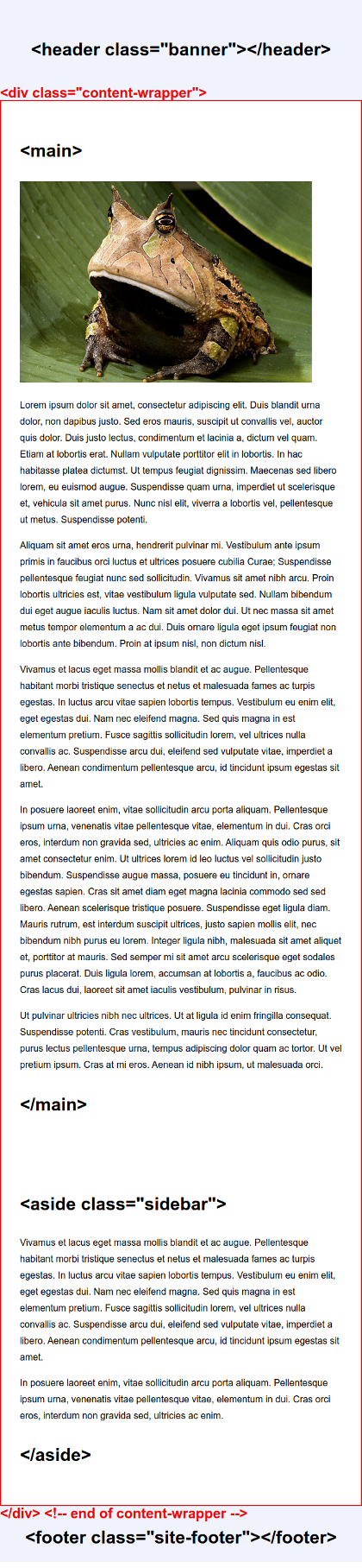
Within the body of my HTML, I'm using this basic structure for the layout:
<header class="banner">
   <h1>Title of my Website</h1>
</header>

<div class="content-wrapper">

   <main>
      <!-- main content of page here -->
   </main>

   <aside class="sidebar">
      <!-- supplementary information here -->
   </aside>

</div> <!-- end of content-wrapper div -->

<footer class="site-footer">
   <!-- footer content here -->
</footer>
As mentioned previously, it's a good idea to start with some basic styling for all devices. And since we are using a mobile-first approach, this will focus on styling that would be appropriate for mobile devices.
On mobile devices, you want to keep it simple. Basically, you just want block-level elements to "behave" as they normally do. You want elements to stack on top of each other (no side-by-side columns). And you want elements to automatically fill the available horizontal space.
So, in my example, I start with just some very basic styling for the elements:
/* because I no like math */
* {
    box-sizing: border-box;
}

body {
    margin: 0;
    font-family: "Helvetica Neue", Helvetica, Arial, sans-serif;
    line-height: 1.8;
}

.banner {
    background-color: #f0f3fc;
    border-bottom: 1px solid #d8e0f7;
    padding: 2em;
}

.banner h1 {
    margin: 0;
    text-align: center;
}

main, .sidebar {
    padding: 2em;
}

.site-footer {
    min-height: 6em;
    background-color: #f0f3fc;
    border-top: 1px solid #d8e0f7;
}

/* make img and video elements flexible */
img, video {
   max-width: 100%;
   height: auto;
}
Notice that I am not using a class for the main element. There can only be one main element per page. So, there would likely be no reason to use a class, unless you needed to style main elements differently in separate pages of your website.
This is my attempt at creating a visual representation of how the HTML and CSS code corresponds to the final result on mobile devices:
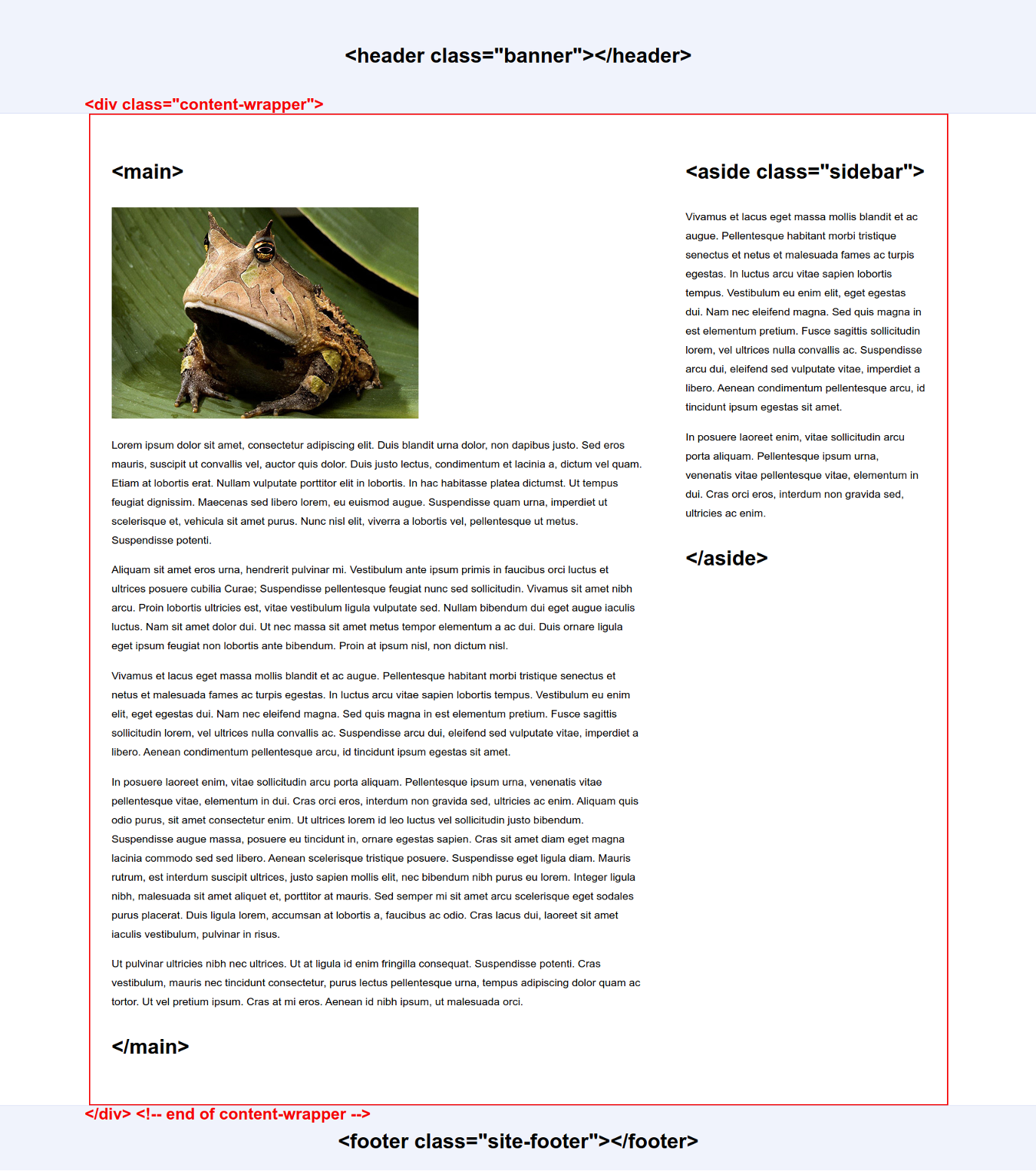
And for larger displays, I'm using a media query to create a 2-column layout:
@media (min-width: 768px) {

   body {
      font-size: 110%;
   }

   .content-wrapper {
      overflow: hidden;
      max-width: 1400px;
      margin: 0 auto;
   }

   /* 2-column layout */
   main {
      float: left;
      width: 67%;
   }

   .sidebar {
      float: left;
      width: 33%;
   }
}
And here is a representation of the desktop layout:
Testing Responsive Layouts
In order see how your layout responds to different widths, you can resize your browser window and watch the layout adapt as the window becomes smaller. There are also tools available for testing.
In Firefox, you can right-click on the page, select "inspect", and click the button on the right that looks like a little phone and tablet. Then you will have the option of emulating several device types. It works very much the same in Chrome, except the button is on the left side.
And, obviously, you could view the page on your phone, tablet, or other device to test your layout.
CSS position property
Elements may be positioned on your web pages using the CSS position property. In combination with some directional properties (top, right, bottom, left), you can precisely place an element on the page.
Static
position: static;
static is the default value for the position property.
This is the default position for an element—where it would be positioned if no CSS positioning is applied.
Relative
You can use relative to position the element relative to its static position.
For example, let's say that we used this CSS to style an img element:
.my-image {
   position: relative;
   top: 40px;
   left: 20px;
}
We are moving the img element from its static position.
This is saying to move it from the top 40 pixels and from the left 20 pixels.
Absolute
By default, if you use absolute as the value, the element will be positioned relative to the entire web page.
.my-image {
   position: absolute;
   top: 20px;
   left: 40px;
}
This is saying to position it 20 pixels from the top of the web page and 40 pixels from the left side of the web page.
However, we can also position the element relative to its parent element.
<header class="site-banner">

   <img class="logo" src="images/logo.png" alt="Frank's French Toast logo">

</header>
We can position the img element in a specific place within its parent by also applying the position property to the header:
.site-banner {
   position: relative;
}

.logo {
   position: absolute;
   top: 20px;
   left: 40px;
}
This is saying to position it 20 pixels from the top of the .site-banner and 40 pixels from the left side of the .site-banner.
Fixed
When fixed is used as the value, the element is positioned relative to the browser window. The element stays fixed within the browser window, even if the user scrolls up or down.
CSS positioning can sometimes be a bit tricky and cause problems for a beginner. It takes the element out of the "natural flow" of the document. When you use absolute and fixed positioning, you are precisely placing the item on the page in a particular place, without regard for the order in which items would normally "flow" in the document.
An element with absolute or fixed positioning no longer takes up space. It will stack on top of other elements and other elements will "ignore" it.
You have likely seen websites with toolbars or banners of some type that have a fixed position at the top or bottom of your browser window. The positioning might be accomplished with CSS like the following:
.site-banner {
   position:fixed;
   top:0;
   z-index: 1000;
   width: 100%;
}
By setting the position to "fixed", the element stays at the top of the browser window without regard to scrolling. The position from the top of the browser window is set to "0". It will be placed at "0px" from the top of the browser. So, all the way at the top.
Notice that a property called z-index has also been used. The z-index sets the stacking order of elements. Since the positioning has taken the element out of the document's normal flow, it will stack on top of some other element. By setting a ridiculously high z-index value, it ensures that the banner will always appear on top of any other elements.
This also means that you may need to use margin to create space at the top of the page. Otherwise, the banner might stack on top of content that you want to be visible.
Also notice that the element is given a width of 100%. Normally, a block-level element will take up the entire horizontal space by default. But this isn't the case when fixed positioning is used.
For more information about the position property, check out the MDN web docs and W3Schools.