5. Images
Relative URLs
It's a good idea to create separate folders for different types of "assets" that are used to create your website. For example, you might create separate folders for storing CSS files and image files. And once you start using programming languages, you'll want to create additional folders for your script files.
In the practice exercise for this lesson, we are going to create a "css" folder for our stylesheet. And we're going to create an "images" folder for our image files.
That means that we're going to have to think about relative URLs. We'll have to determine how to give directions from a file in one folder to a file in another folder.
The relative URL needs to give directions from the file in which you are typing the URL to the file you are referencing.
We are going to embed images using the HTML <img> element. And those URLs will be typed in our index.html file.
So, we will need to provide directions from index.html to the image file. That one is pretty simple:
<img src="images/the_image_file.jpg" alt="the description">
However, the URLs for background-images will be provided in the CSS file. And the image files and the CSS file will be in separate folders.
We need to provide directions from the style.css file to the image file.
So, since the "images" folder is not inside "css", the first step is to leave "css". And that is indicated with 2 dots, followed by a slash:
../
Now we are outside of "css" and at the same place that index.html is located. So, now we provide the rest of the path to get to the file:
../images/the_bg_file.png
The CSS code will look something like this:
background-image: url(../images/the_bg_file.png);
We'll discuss background images further along in this lesson. Keep reading for all of the exciting details.
Image formats
See this in-depth guide on image formats.
JPEG
JPEG (Joint Photographic Experts Group) is a good choice for photographic images.
JPEG produces decent quality with an acceptable file size.
It's fine to use either .jpeg or .jpg as the file extension.
PNG
PNG (Portable Network Graphics) is a good choice when you need to preserve a lot of detail in the image. It works well for screenshots, text, and graphics with a lot of detail and colors.
PNG supports transparency, which makes it possible to have a see-through canvas, allowing the web page to show through the background of the image.
GIF
GIF (Graphics Interchange Format) is an acceptable choice for simple animations or simple graphics without a lot of colors, such as logos and icons. GIF also supports transparency.
SVG
SVG (Scalable Vector Graphics) is a good choice for flat illustrations, such as simple logos and icons. SVG graphics are created using XML code. They won't slow down page loads or require a lot of data transfer like traditional image files can.
WEBP
WEBP (Web Picture) is a newer format developed by the people at Google. It is an excellent choice for nearly any type of photograph, graphic, or animation. It is one of the best options for preserving quality at a smaller file size.
Optimizing images for the Web
When using images, you should think about how it will impact the speed of your web page. You might assume that everyone has high speed Internet these days. But that's not the case. There are many people in the world with slow and unreliable Internet connections. Many of these people are here in the United States—often in rural areas.
We also have to consider data usage. This could be a concern for both the website visitor and the website owner.
Larger image files will use up more of the user's data than is necessary. And if the website owner is paying their web hosting company based upon data transfer, the costs could add up, especially for highly trafficked websites.
Your goal when creating images for your web pages should be to have the highest acceptable quality possible with the smallest file size possible. You should experiment with different image formats, dimensions, and settings to best optimize the image.
If there is unnecessary space in the image, crop it out. If the image could bear to be a bit smaller, make it so. If the image isn't really necessary, don't use it. Every little bit helps :)
IMG width and height attributes
When embedding an image, you can provide the width and height:
<img src="images/the-image.jpg" alt="The description" width="600" height="400">
This should be used to communicate the actual width and height of the image in pixels. It shouldn't be used to change the display size of the image.
This is meta information about the image file that can help the browser layout the page more quickly. With this information, the browser doesn't have to download the image and calculate the size of the image before rendering the page. It can just create a box with those dimensions on the page and the image will fill into this box as it downloads.
If you want the image to display at a smaller size, you should resize it in a photo editor, such as Photoshop or Gimp.
Shrinking the dimensions of the image in a photo editor will make the image file size smaller. This will allow the page to load more quickly and will reduce the amount of data transfer required.
Content delivery networks (cdn)
The geographic distance between the website visitor and the server hosting the website can also affect the speed of page loads.
A content delivery network (cdn) is a service that will save a copy of your files on servers throughout the world.
In other words, it can reduce the distance between the user and server. And that might help speed up page loads.
CDNs, such as Cloudflare, are commonly used for hosting image, video, CSS, and JavaScript files.
The alt attribute
This is very important for accessibility purposes. This provides a description of the image for those with visual impairments.
The screen reader program will read the alt value to the user.
If there is text in the image, the alt attribute should include this text.
Imagine if you could not see the image. What information would you need to understand what appears in this image?
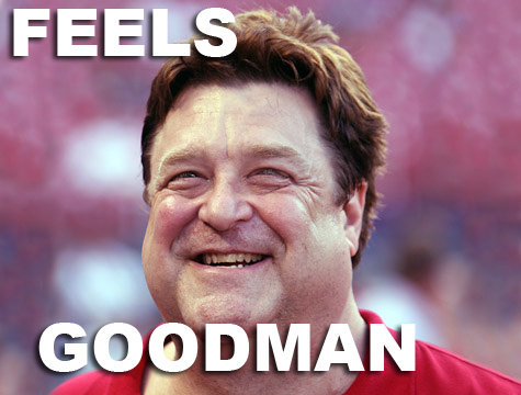
This is probably sufficient:
<img src="feels-goodman.jpg" alt="John Goodman smiling with the text 'Feels Goodman'">
You don't want to be overly verbose. You just want to briefly communicate the meaning conveyed by the image.
If the image is purely for decorative purposes and provides no important meaning, you can leave the alt attribute blank:
<img src="nothing-important.jpg" alt="">
This instructs the screen reader program to ignore this image.
With that said, if it is only for decorative purposes, you should probably be using a CSS background-image instead.
The value for the alt attribute also communicates meaning to search engines.
Case sensitivity
When I was teaching for a university, I would get several emails from students each semester stating the following: "My image shows up fine in the page saved on my computer. But when I upload to the server and view on the web, the image is not showing up."
Case sensitivity was almost always the problem.
File and folder names are not case-sensitive on Mac or Windows computers. For example, Picture.jpg and picture.jpg may be used interchangeably.
However, most servers use operating systems based on Unix. On these systems, file and folder names are case-sensitive. For example, picture.JPG and picture.jpg are not considered to be the same file name. The case used in your URL has to match the case used in the file name.
In my opinion, the best solution is to rename all image file names to all lowercase. Then always use lowercase in your URLs. If you use this practice, you can completely eliminate this problem.
Centering images
Block-level elements may be centered with this CSS:
margin-right: auto;
margin-left: auto;
However, img elements aren't block-level elements. They are inline-block elements. So, we need to use the display property to make it a block-level element.
HTML:
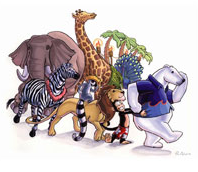
<img class="img-center" src="images/way_awesome.png" alt="Conga line at the zoo" width="198" height="172">
CSS:
.img-center {
  display: block;
  margin-right: auto;
  margin-left: auto;
}
OUTPUT:
You may have noticed that my class name isn't very semantic here.
img-center merely describes how the image will look on the screen. This is one of those cases where there might not be a great semantic alternative. But it's something you should be thinking about.Floating images
In the next lesson, we're going to learn how to create a page layout using the float property. But let's take a sneak peek at floats right now.
When a float is defined for a particular element, it means that the element will move to the direction specified and anything after the floated element will wrap to the other side of the element. It is commonly used to wrap text around an image.
HTML:
<img class="img-left" src="images/way_awesome.png" alt="Conga line at the zoo" width="198" height="172">

<p>This is some text that I want to wrap around the right side of the image. Let's add some Lorem Ipsum: Lorem ipsum dolor sit amet, consectetur adipiscing elit. Nam nibh massa, cursus in commodo et, interdum dictum elit. Aenean vel ante eu odio faucibus faucibus. In vitae sapien sit amet arcu egestas dignissim et nec leo. Cras fermentum commodo gravida. Proin consectetur dapibus justo eget gravida. Donec porta massa sit amet augue lobortis ut gravida elit euismod.</p>

<p>Nam nibh massa, cursus in commodo et, interdum dictum elit. Aenean vel ante eu odio faucibus faucibus. In vitae sapien sit amet arcu egestas dignissim et nec leo.</p>
CSS:
.img-left {
  float: left;
}
OUTPUT:
This is some text that I want to wrap around the right side of the image. Let's add some Lorem Ipsum: Lorem ipsum dolor sit amet, consectetur adipiscing elit. Nam nibh massa, cursus in commodo et, interdum dictum elit. Aenean vel ante eu odio faucibus faucibus. In vitae sapien sit amet arcu egestas dignissim et nec leo. Cras fermentum commodo gravida. Proin consectetur dapibus justo eget gravida. Donec porta massa sit amet augue lobortis ut gravida elit euismod.
Nam nibh massa, cursus in commodo et, interdum dictum elit. Aenean vel ante eu odio faucibus faucibus. In vitae sapien sit amet arcu egestas dignissim et nec leo.
Let's add a margin to the image to make it look a little better.
CSS:
.img-left {
  float: left;
  margin-right: 16px;
}
OUTPUT:
This is some text that I want to wrap around the right side of the image. Let's add some Lorem Ipsum: Lorem ipsum dolor sit amet, consectetur adipiscing elit. Nam nibh massa, cursus in commodo et, interdum dictum elit. Aenean vel ante eu odio faucibus faucibus. In vitae sapien sit amet arcu egestas dignissim et nec leo. Cras fermentum commodo gravida. Proin consectetur dapibus justo eget gravida. Donec porta massa sit amet augue lobortis ut gravida elit euismod.
Nam nibh massa, cursus in commodo et, interdum dictum elit. Aenean vel ante eu odio faucibus faucibus. In vitae sapien sit amet arcu egestas dignissim et nec leo.
And now to the right...
HTML:
<img class="img-right" src="images/way_awesome.png" alt="Conga line at the zoo" width="198" height="172">

<p>This is some text that I want to wrap around the right side of the image. Let's add some Lorem Ipsum: Lorem ipsum dolor sit amet, consectetur adipiscing elit. Nam nibh massa, cursus in commodo et, interdum dictum elit. Aenean vel ante eu odio faucibus faucibus. In vitae sapien sit amet arcu egestas dignissim et nec leo. Cras fermentum commodo gravida. Proin consectetur dapibus justo eget gravida. Donec porta massa sit amet augue lobortis ut gravida elit euismod.</p>

<p>Nam nibh massa, cursus in commodo et, interdum dictum elit. Aenean vel ante eu odio faucibus faucibus. In vitae sapien sit amet arcu egestas dignissim et nec leo.</p>
CSS:
.img-right {
  float: right;
  margin-left: 16px;
}
OUTPUT:
This is some text that I want to wrap around the right side of the image. Let's add some Lorem Ipsum: Lorem ipsum dolor sit amet, consectetur adipiscing elit. Nam nibh massa, cursus in commodo et, interdum dictum elit. Aenean vel ante eu odio faucibus faucibus. In vitae sapien sit amet arcu egestas dignissim et nec leo. Cras fermentum commodo gravida. Proin consectetur dapibus justo eget gravida. Donec porta massa sit amet augue lobortis ut gravida elit euismod.
Nam nibh massa, cursus in commodo et, interdum dictum elit. Aenean vel ante eu odio faucibus faucibus. In vitae sapien sit amet arcu egestas dignissim et nec leo.
Clearing Floats
We'll discuss the float property in greater detail in the next lesson. But here's a bit of information that might come in handy right now.
When, for example, you use float: left for an element, that floated element will move to the left. And the content after the floated element will move to the right side of the floated element.
It's like there is a vacuum on the right side of the element sucking everything after it up to its right side :)
This can sometimes cause problems on your page. You may notice that things look a bit wacky and you're not sure why.
You may need to "clear" your floats. Clearing the float will stop this floating behavior at a certain point in the page.
There are several ways to clear floats, which we will discuss in more detail in the next lesson. For now, here is a simple solution to stop elements from wrapping to the right or left of a floated element.
Create a class in the CSS:
.clear {
  clear: both;
}
Add this in the HTML at the point(s) where you want the floating behavior to stop:
<div class="clear"></div>
For example:
<img class="img-left" src="images/way_awesome.png" alt="Conga line at the zoo" width="198" height="172">

<p>This is some text that I want to wrap around the right side of the image. Let's add some Lorem Ipsum: Lorem ipsum dolor sit amet, consectetur adipiscing elit. Nam nibh massa, cursus in commodo et, interdum dictum elit. Aenean vel ante eu odio faucibus faucibus.</p>

<div class="clear"></div> <!-- I want the floating behavior to stop here -->
This may not make a whole lot of sense right now. It will make more sense as you get more experience with using floats.
HTML5 figure and figcaption elements
As we have already discussed, HTML5 introduced new semantic elements. The figure and figcaption elements can be used for images and their captions. Notice that I added the class to the figure element instead of the img this time.
HTML:
<figure class="img-left">

  <img src="images/way_awesome.png" alt="Conga line at the zoo" width="198" height="172">

  <figcaption>A Conga line at the zoo</figcaption>

</figure>

<p>This is some text that I want to wrap around the right side of the image. Let's add some Lorem Ipsum: Lorem ipsum dolor sit amet, consectetur adipiscing elit. Nam nibh massa, cursus in commodo et, interdum dictum elit. Aenean vel ante eu odio faucibus faucibus. In vitae sapien sit amet arcu egestas dignissim et nec leo. Cras fermentum commodo gravida. Proin consectetur dapibus justo eget gravida. Donec porta massa sit amet augue lobortis ut gravida elit euismod.</p>

<p>Nam nibh massa, cursus in commodo et, interdum dictum elit. Aenean vel ante eu odio faucibus faucibus. In vitae sapien sit amet arcu egestas dignissim et nec leo.</p>
CSS:
.img-left {
  float: left;
}
OUTPUT:
This is some text that I want to wrap around the right side of the image. Let's add some Lorem Ipsum: Lorem ipsum dolor sit amet, consectetur adipiscing elit. Nam nibh massa, cursus in commodo et, interdum dictum elit. Aenean vel ante eu odio faucibus faucibus. In vitae sapien sit amet arcu egestas dignissim et nec leo. Cras fermentum commodo gravida. Proin consectetur dapibus justo eget gravida. Donec porta massa sit amet augue lobortis ut gravida elit euismod.
Nam nibh massa, cursus in commodo et, interdum dictum elit. Aenean vel ante eu odio faucibus faucibus. In vitae sapien sit amet arcu egestas dignissim et nec leo.
The figure element is a block-level element. It will take up the entire width of the page (or of its parent element) by default. You can't center something that is taking up the entire horizontal space.
So, if you wanted to center it, one option is to give it a specific width with CSS.
But it might not be practical to provide a specific width for each figure element on a website.
Here's a trick for centering figure elements:
CSS:
.img-center {
  display: table;
  margin-right: auto;
  margin-left: auto;
}
Why does this work?
A table element is that exception to the rule about block-level elements taking up the entire width by default. The table element only takes up the space required for the content inside.
This makes the figure element "behave" like a table.
CSS shorthand properties
Here in a little bit, we're going to discuss CSS background images. There is a background shorthand property. So, let's discuss the concept of shorthand properties first.
Shorthand properties allow you to provide the values for multiple related properties with a single declaration.
In addition to background, some other shorthand properties include font, border, margin, and padding.
When you use the shorthand padding property in this way:
padding: 20px;
You are actually communicating this:
padding-top: 20px;
padding-right: 20px;
padding-bottom: 20px;
padding-left: 20px;
20px padding is applied to each side of the element. We are actually providing the value for four separate properties.
You can also provide multiple values separated by spaces:
padding: 20px 10px 20px 10px;
The first is padding-top, then padding-right, then padding-bottom, and then padding-left.
Notice that this is clockwise: Top Right Bottom Left
Or some remember this with T R B L: Trouble
Also notice that the values I provided for padding-top and padding-bottom are the same (20px). And that's also the case for padding-right and padding-left (10px).
In this case, I could shorten this code even more:
padding: 20px 10px;
When only two values are provided, the first is applied to the top and bottom (20px) and the second value is applied to the right and the left (10px).
The shorthand margin property works like this also.
And here's an example of using the shorthand border property:
border: 1px solid #000;
That is the same as using this longform version:
border-width: 1px;
border-style: solid;
border-color: #000;
When using the shorthand border property, a border-style (e.g., "solid") is required. The border will not show up without a border-style
And notice that my color code only uses 3 characters after the hash symbol (#000). A full color code is 6 characters.
However, when the full code is 6 identical characters, such as #000000, you can shorten it to 3 characters.
CSS background images
CSS background images can be applied to any HTML element on your page.
You could add a background image to the entire body of the page by using body as your selector. Or you could select an individual element to apply the background image, such as a divor p element.
We'll discuss creating layouts in the next lesson. At that point, you might decide to add a background image to one or more of the elements that are used to create a layout: the header, main, aside, or footer elements.
When to choose a CSS background-image (vs. an HTML img element)
CSS background images should be used for aesthetic purposes. It should not be used for images that convey an important message.
With an HTML img element, you can add the alt attribute and provide a text description of the image. With CSS background images, this is not possible.
So, if the image contains text or is an important part of your main content and message, an HTML img element should be used instead.
When making these choices, think about those with visual impairments. Put yourself in their shoes. If you only had access to the text and HTML code, would you be getting the entire message? Make sure that your code communicates.
background-image
Before we start with the CSS code, let's address the facts of my situation.

Inside my "5" folder, I have a folder named "css". Inside that, I have my CSS file.
Also inside my "5" folder, I have a folder named "images". This contains a file named monkey.png.

And also within "5", I have an index.html file. It contains this div:
<div class="intro">

  <p>Since background-images are not content, they will not cause your element to stretch to the dimensions of the background-image. Background-images just fill the space in the background of an element.</p>
  <p>Without a height and without any content inside the element, the element collapses to nothing and the background will not appear on the screen.</p>

</div> <!-- end of intro div -->
I want to use monkey.png as a background-image for this div.
So, here's my CSS code:
.intro {
  background-image: url(../images/monkey.png);
}
And here's an approximation of what that might look like:
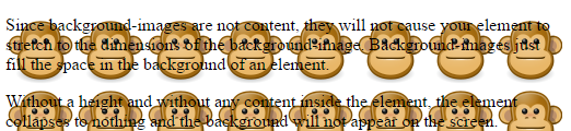
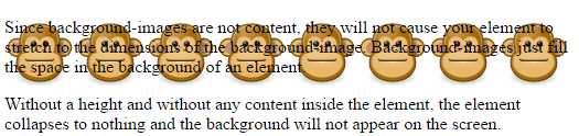
By default, the background-image will repeat throughout the entire element. That's not exactly what I had in mind for this.
background-repeat
The default value for background-repeat is "repeat". That means that it will tile throughout the background of the entire element. To change this, you can provide your own value for background-repeat.
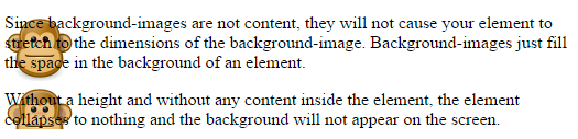
I don't want it to repeat:
.intro {
  background-image: url(../images/monkey.png);
  background-repeat: no-repeat;
}
Here's what that looks like:
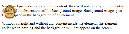
By default, the background-image will be placed on the left side at the top of the element. We'll talk about changing the background-position in just a little bit.
First, here are some other possible values for background-repeat
.intro {
  background-image: url(../images/monkey.png);
  background-repeat: repeat-x;
}
This will repeat it in a single line across the element (x-axis)
And to repeat the background-image down the y-axis:
.intro {
  background-image: url(../images/monkey.png);
  background-repeat: repeat-y;
}
background-position
I've decided that I want the monkey centered vertically on the right side of the element.
So, I will use right center for the background-position:
.intro {
  background-image: url(../images/monkey.png);
  background-repeat: no-repeat;
  background-position: right center;
  padding-right: 80px;
}
I also added some padding on the right side so the text would scoot over and not overlap the background-image.
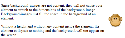
The first value for background-position provides the horizontal position (x-axis).
I used "right" to position it on the right side of the element.
The second value provides the vertical position (y-axis).
I used "center" to place the image in the middle of the y-axis (center it vertically).
And actually, I could have left off "center" and just used this:
background-position: right;
When you don't provide a second value, it defaults to "center". So, it would have worked the same without it.
Keyword values for background-position
Once again, the first value provides the horizontal position and the second provides the vertical position.
Here are some possible combinations:
- left top (default value)
- left center
- left bottom
- right top
- right center
- right bottom
- center top
- center center
- center bottom
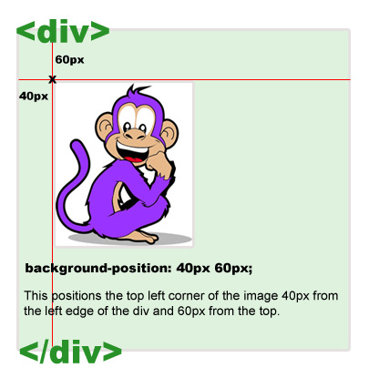
Pixel values for background-position
Here's an example using pixel values:
background-position: 40px 60px;
The first value positions the top left corner of the image 40px from the left side of the div.
The second value positions the top of the image 60px from the top of the div.
Percentage values for background-position
Using percentages can get a little bit more complicated.
This one seems simple enough. This is the equivalent of using center center.
background-position: 50% 50%;
This would center the background-image both horizontally and vertically. But think about this for a second. It's not as simple as it might seem at first.
The first value provides the horizontal position. The browser finds the point 50% across the image. And it also finds the point 50% across the div.
The second value provides the vertical position. It represents a point 50% from the top of the image and a point 50% from the top of the div.
All of these points are aligned to determine the position of the background image.
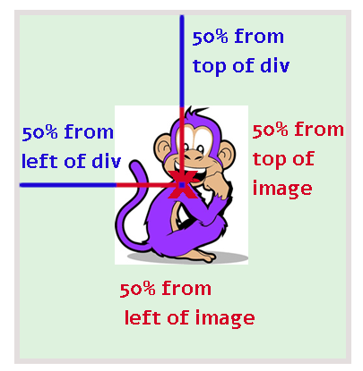
This one kind of hurts my brain:) Here is a detailed explanation of this concept.
background shorthand property
The background shorthand property allows you to provide values for multiple background-related properties with a single declaration.
For example:
background: url(../images/monkey.png) no-repeat right center;
With this single declaration, we have provided values for background-image, background-repeat, and background-position.
This is the same as using this:
background-image: url(../images/monkey.png);
background-repeat: no-repeat;
background-position: right center;
There are additional background properties I could add. For example, here I've added a background-color as the first value:
background: #e5e5e5 url(../images/monkey.png) no-repeat right center;
Be careful with shorthand properties
But if you use a shorthand property and leave off one of these possible values, it reverts to the default for that property.
For example, if you used this code in this order:
background-image: url(../images/monkey.png);
background-repeat: no-repeat;
background-position: right center;
background: #e5e5e5;
...the background-image has reverted to "none". That shorthand background property appears last and doesn't contain a value for background-image.
This is what the above code is actually communicating:
background: #e5e5e5 none repeat 0% 0%;
background-image is reverted to its default value of "none". And the default values for background-repeat and background-position are also reverted.
However, it would work if you put the shorthand background property first:
background: #e5e5e5;
background-image: url(../images/monkey.png);
background-repeat: no-repeat;
background-position: right center;
...because the last values in the stylesheet for background-image, background-repeat, and background-position actually provide the values we want.
Remember that rule about CSS precedence? When all else is equal, the last declaration wins.
So, if you are going to use a shorthand property, it's best to either provide all of the values at once with the shorthand property or make sure that the shorthand property appears before any of the long form properties.
Multiple background images
You can apply more than one background-image to the same element.
Let's say you had an image that you wanted to repeat down the left side of the body of the page. And you had another image that you wanted to repeat down the right side of the body.
Here's an example of what your CSS code might look like:
body {
  background-image: url(images/leftbg.png), url(images/rightbg.png);
  background-position: left top, right top;
  background-repeat: repeat-y;
}
The relative URLs used here assume that the PNG files are inside a folder named "images" that is in the same folder as the CSS file.
In this case, either the CSS file is not inside its own folder or there is an "images" folder within the folder containing the CSS files.
Relative URLs change based upon the location of the files. They are ... well, relative.
Background images are not content
If you put text or <img> elements inside an element, it will stretch the element vertically. It gets bigger to accommodate the size of the content inside.
But CSS background images will not impact the size of the element. They only fill the space in the background.
So, if your element is empty, and you have not given that element a height in the CSS, the background image will not show up on the page.
For example, if you created an empty div...
<div class="wonderdiv">

</div>
...and tried to add a background-image...
.wonderdiv {
  background-image: url(../images/monkey.png);
}
...you wouldn't see anything on the page.
The div has no height and no content inside to stretch it vertically. There is nothing to see here.